


In today's fast-paced, digital-first world, it's easy to get caught up in the allure of perfectly aligned text, crisp lines, and flawlessly polished presentations. While these elements have their place, there's a risk that they can feel distant—too perfect, too mechanical, too impersonal. But at the heart of every presentation, report, or piece of content is a simple truth: we're trying to connect with people.
And perfection is an illusion—nothing in nature is perfectly straight. What if your polished presentation was balanced with just enough human touch to reflect the complexity and authenticity of real life?

The Importance of Humanizing Your Content
When you strip away the human element from your content—whether it's a presentation, a social media post, or a newsletter—you risk losing the emotional connection that drives engagement and action. The most effective content doesn't just inform; it resonates. It feels real, relatable, and relevant. One of the most powerful ways to achieve this is by incorporating organic design elements that mirror the imperfections and nuances of the human experience.
But let's be clear: I'm not suggesting that your entire presentation should be filled with handwritten fonts or overrun with organic shapes. The key is to sprinkle in these touches of authenticity to complement and enhance your already polished and professional design. Think of it as adding a dash of personality to your content—a subtle way to make your message more relatable without sacrificing the clean, crisp aesthetic that keeps your presentation sharp and focused.
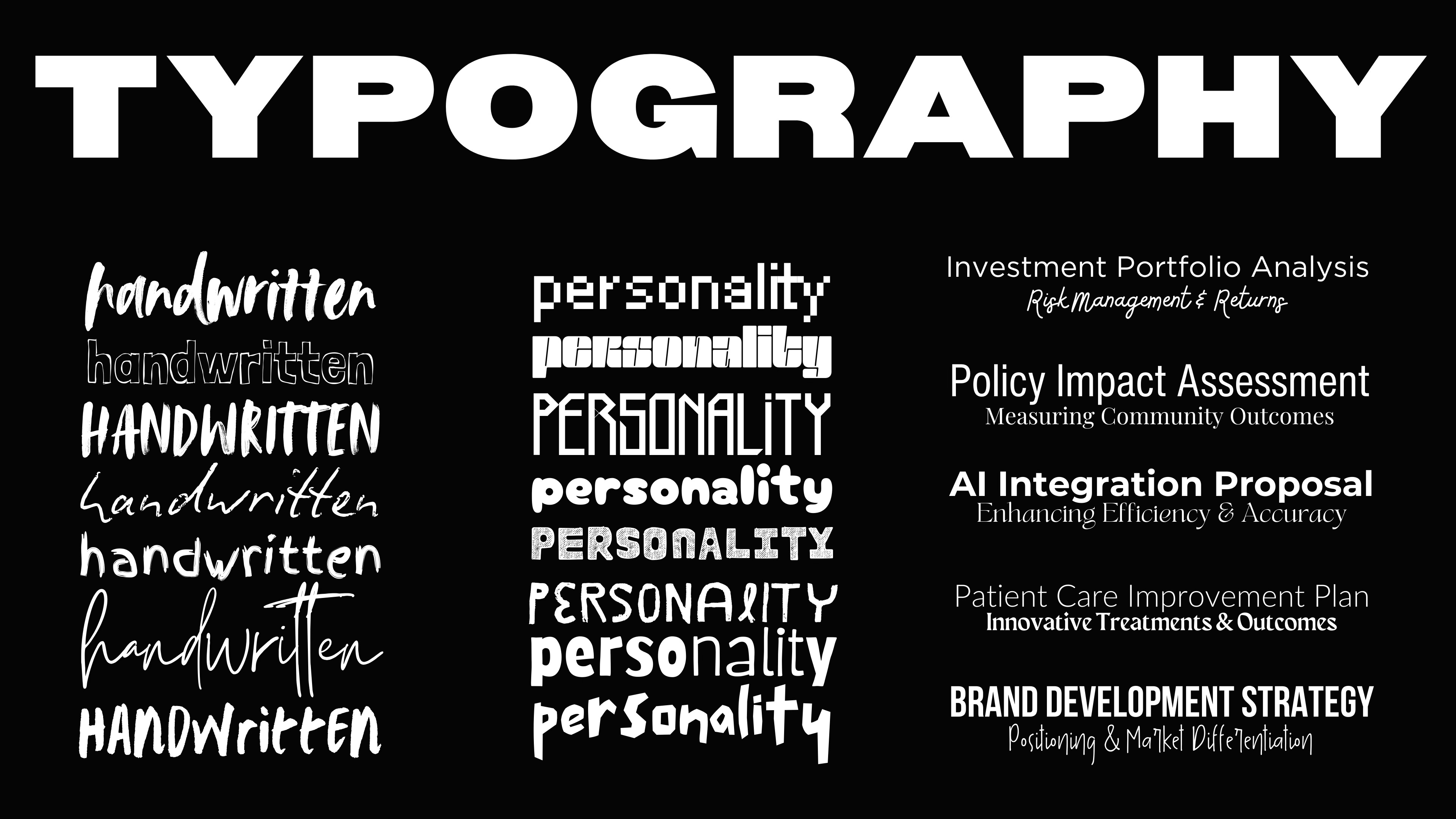
Choosing Fonts That Reflect Humanity
Fonts are more than just a design choice—they're a powerful communication tool. While clean, sans-serif fonts offer excellent readability, they can sometimes feel cold and impersonal. To foster a more human connection, consider incorporating fonts that mimic handwriting or have a hand-crafted feel.
Handwritten Styles:
Fonts with a handwritten or hand-drawn appearance evoke the warmth of personal notes or letters. They can make your content feel more intimate and personal, as if you're speaking directly to your reader.
Pro Tip: Use these fonts for titles, quotes, or key points to highlight their significance. Pair them with a more traditional font for body text to maintain readability and balance.
Fonts with Character:
Explore fonts that have slight imperfections or unique quirks. These fonts add character and a sense of authenticity to your content, making it more engaging and relatable.
Pro Tip: Ensure legibility by using these fonts sparingly and in larger sizes, particularly for headers or emphasized points. The goal is to enhance, not overwhelm, your design.

Incorporating Softer, Organic Shapes
Shapes are another design element that can dramatically impact how your content is perceived. Sharp, angular shapes convey precision and structure, but they can also feel rigid and uninviting. In contrast, organic shapes—those with curves, uneven edges, or hand-drawn qualities—create a sense of warmth and approachability.
Using Curved Lines and Shapes:
Replace sharp rectangles with rounded corners, or use circles and ovals to soften the overall look of your content. These shapes feel more natural and can help create a sense of flow and movement.
Pro Tip: Consider incorporating hand-drawn lines or shapes as accents. These elements guide the viewer's eye in a way that feels intuitive and less mechanical. But remember, these should be accents—use them strategically to draw attention or add warmth without detracting from the overall design.
Embracing Imperfection:
Incorporate elements that aren't perfectly symmetrical or aligned. A slightly tilted image or an uneven line adds spontaneity and realism to your content.
Pro Tip: Balance is key—use imperfect elements strategically to add character without sacrificing professionalism. Your content should still feel cohesive and well-structured, with these organic touches serving to enhance rather than dominate.

The Human Element in Imagery
Images of people are one of the most powerful tools for forging a genuine connection with your audience. While it’s easy to rely on generic visuals, nothing compares to the impact of showing real people in authentic situations. Photos that capture genuine emotions and interactions—such as a team deep in collaboration, an individual sharing a thoughtful idea, or a simple moment of reflection—resonate more deeply with audiences than any image of objects, tools, or abstract concepts.
Choosing Relatable Imagery
Human faces naturally draw attention and create a sense of connection, making your content not only more engaging but also more memorable. Candid photos that highlight these human elements can significantly boost engagement, offering a more personal and relatable experience.
Pro Tip: When possible, use images of your actual team or clients to add an extra layer of authenticity to your content.
Integrating Organic Design with Imagery:
Blend photos with hand-drawn elements or overlays. For instance, add a hand-drawn arrow or circle around a critical part of the image to draw attention in a natural, engaging way.
Pro Tip: Maintain a consistent style throughout your content to create a cohesive, polished look. These organic elements should complement the overall design, not compete with it.
Bringing It All Together: The Power of Connection
At the end of the day, the most effective content is content that connects. By humanizing your design—through fonts, shapes, or imagery—you create an authentic and relatable experience. This isn't just about aesthetics; it's about making your message resonate on a deeper, emotional level.
Embrace the organic, the imperfect, and the human elements that make your work not just informative, but truly engaging. When you do, you'll find that your audience isn't just listening—they're connecting, feeling, and responding.
But don’t forget—these elements should be used to complement the aligned, crisp, and professional content that forms the backbone of your presentation. It’s about finding the right balance between polish and personality, structure and spontaneity.
Enjoyed this Article?
If you found value in this post, consider sharing it with your network! Your support helps spread the word about creating content that truly connects.
Subscribe to explore a mix of visualized defense and leadership concepts alongside practical communication tips. Stay ahead with insights that bridge the gap between complex strategies and clear, impactful messaging.
Let’s Connect!
If you have thoughts, questions, or just want to chat, feel free to reach out. I’d love to hear from you!
🔗 Follow me on LinkedIn | Follow me on X
About the Author
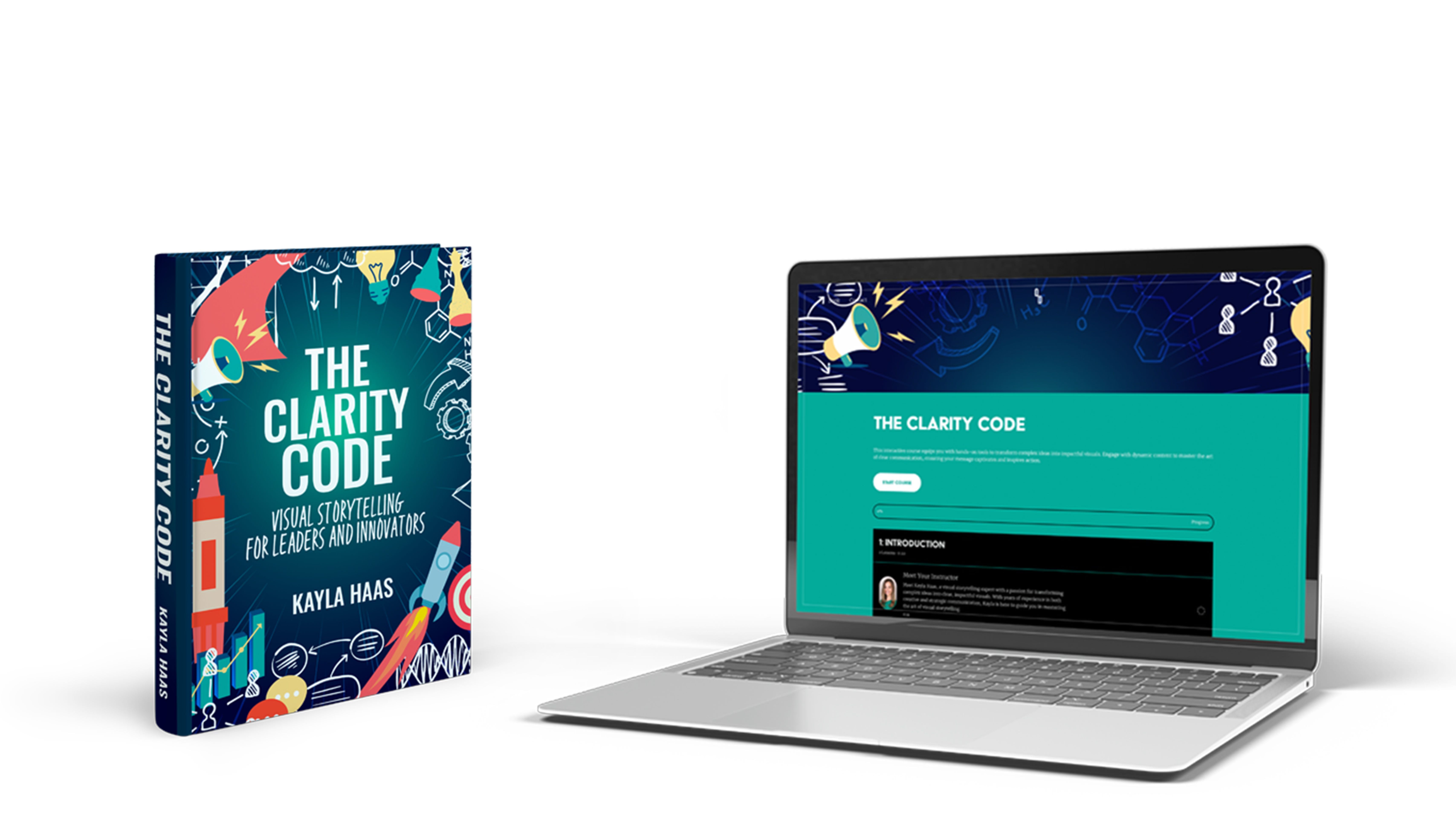
I’ve always been captivated by the power of visual communication. From my early days experimenting with Microsoft PowerPoint on my parents' old computer to transforming complex ideas into compelling visuals, I’ve learned that the best content doesn’t just inform—it connects. Whether it's a presentation, a report, or a social media post, my focus is on making your message resonate on a human level. Stay tuned for the release of The Clarity Code: Visual Storytelling for Leaders and Innovators, a comprehensive book and online course designed to help you cut through the noise and turn complex concepts into powerful visuals that captivate and inspire.
I'm laughing right now. Not because I think this post is funny, but because it makes so much sense to me now. When we created The Military Reading Room, (like yesterday)... we chose a Stencil font because it reminded us of spray painting our names on foot lockers. I'm not sure anyone else will pick up on that, but it made sense at the time. Great post, Kayla.
Great article Kayla! In a similar vein I always reference the approach the Federal Reserve takes with the “Beige Book”. It’s economic data colourized with anecdotes that humanize the stats. NPR’s The Indicator podcast even has a “Beigey Award” for the best anecdote.